Sans Ceuticals: Essential Care
Design-led personal care built on restraint, clarity, and purpose — refined for performance on Shopify.
Sans Ceuticals partnered with Codora Labs to optimise their Shopify storefront with a focus on conversion, usability, and clarity. The objective was to improve the customer journey while preserving the brand’s minimalist identity, ensuring the site supported both storytelling and seamless purchasing. The result is a more intuitive, high-performing experience that allows the products to speak for themselves.

Audited the existing customer journey to identify friction and drop-off points
Refined information hierarchy to improve product discovery and decision-making
Aligned site structure with brand values and purchasing behaviour
Preserved the brand’s minimal aesthetic while improving functional clarity
Simplified key touchpoints across product and collection pages
Enhanced mobile usability for a distraction-free browsing experience
Implemented performance-focused refinements across core templates
Improved page responsiveness and interaction consistency
Ensured changes supported long-term maintainability and flexibility

Sans Ceuticals’ existing Shopify store reflected a strong brand identity, but certain elements
of the experience created friction for customers navigating the purchase journey. As the product
range and content evolved, opportunities emerged to improve clarity, flow, and ease of use
without compromising the brand’s understated aesthetic.
Codora Labs partnered closely
with the Sans Ceuticals team to refine the storefront through a series of considered CRO
improvements. The focus was on simplifying navigation, strengthening product presentation, and
removing unnecessary steps that slowed customers down. Every adjustment was made with restraint,
ensuring the experience remained calm, intentional, and brand-aligned.
The result is
a more intuitive digital storefront that balances form and function. Customers can explore,
understand, and purchase products with greater ease, while the brand retains full control over
how its story is told online.


The challenge
- Product information was not always surfaced at the right moments
- Navigation paths required unnecessary effort to reach key products
- Mobile experiences needed refinement for smoother interaction
- Purchase journeys included friction that slowed decision-making
- The balance between storytelling and usability needed recalibration
- Internal updates required more flexibility and efficiency
The solution
- Refined site structure to guide customers more intuitively
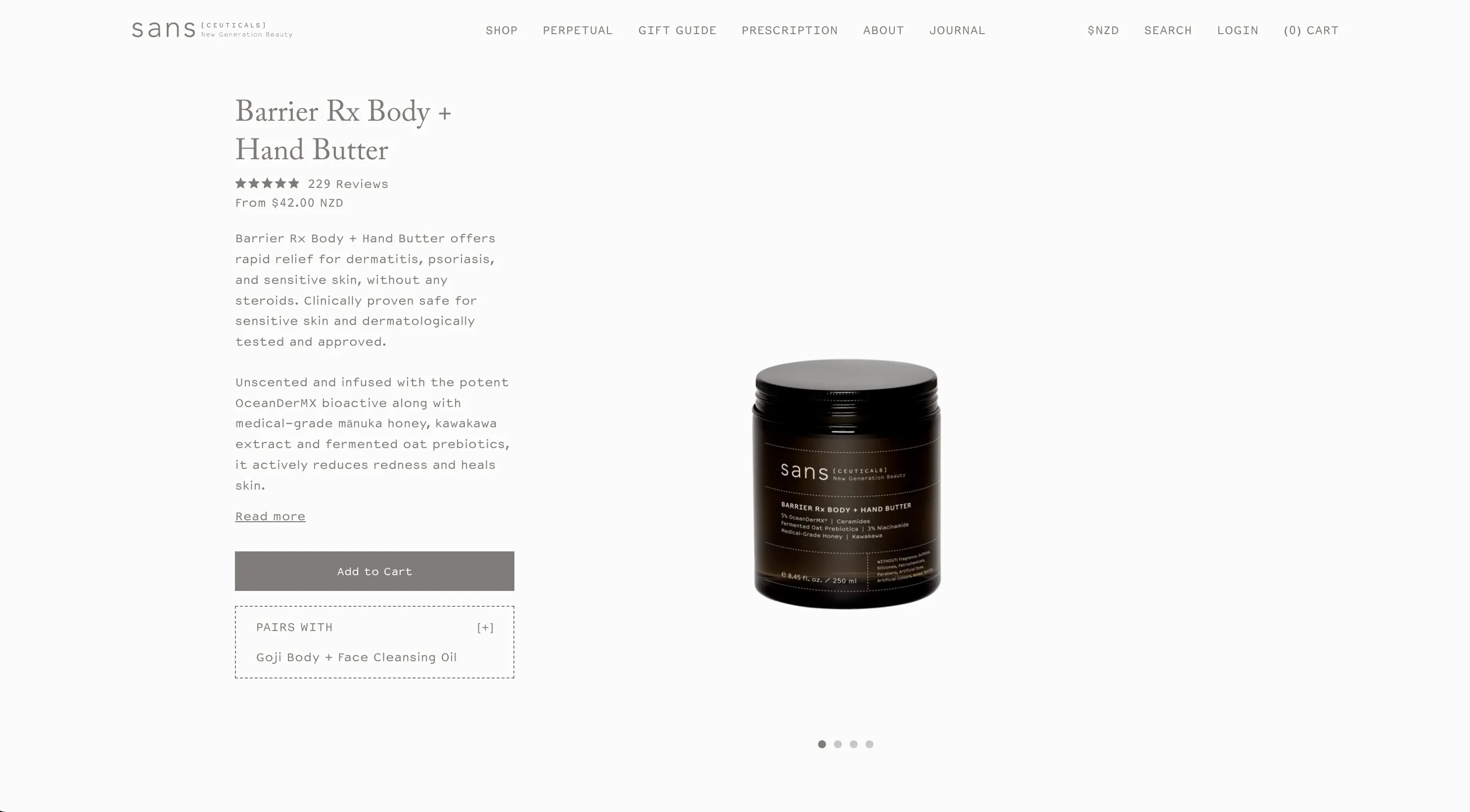
- Improved product page clarity to support confident purchasing
- Simplified navigation and filtering across collections
- Enhanced mobile usability for distraction-free browsing
- Optimised key templates to reduce friction across the funnel
- Preserved brand restraint while improving functional performance
- Enabled easier internal management of content and updates